
In today’s digital world, mobile devices have become an essential part of our daily life. We use them to communicate with friends and family, to stay up to date on current events, and, increasingly, to buy for goods and services. According to Statista, mobile commerce sales are predicted to reach $5.2 trillion in 2023, accounting for more than 70% of all e-commerce transactions.
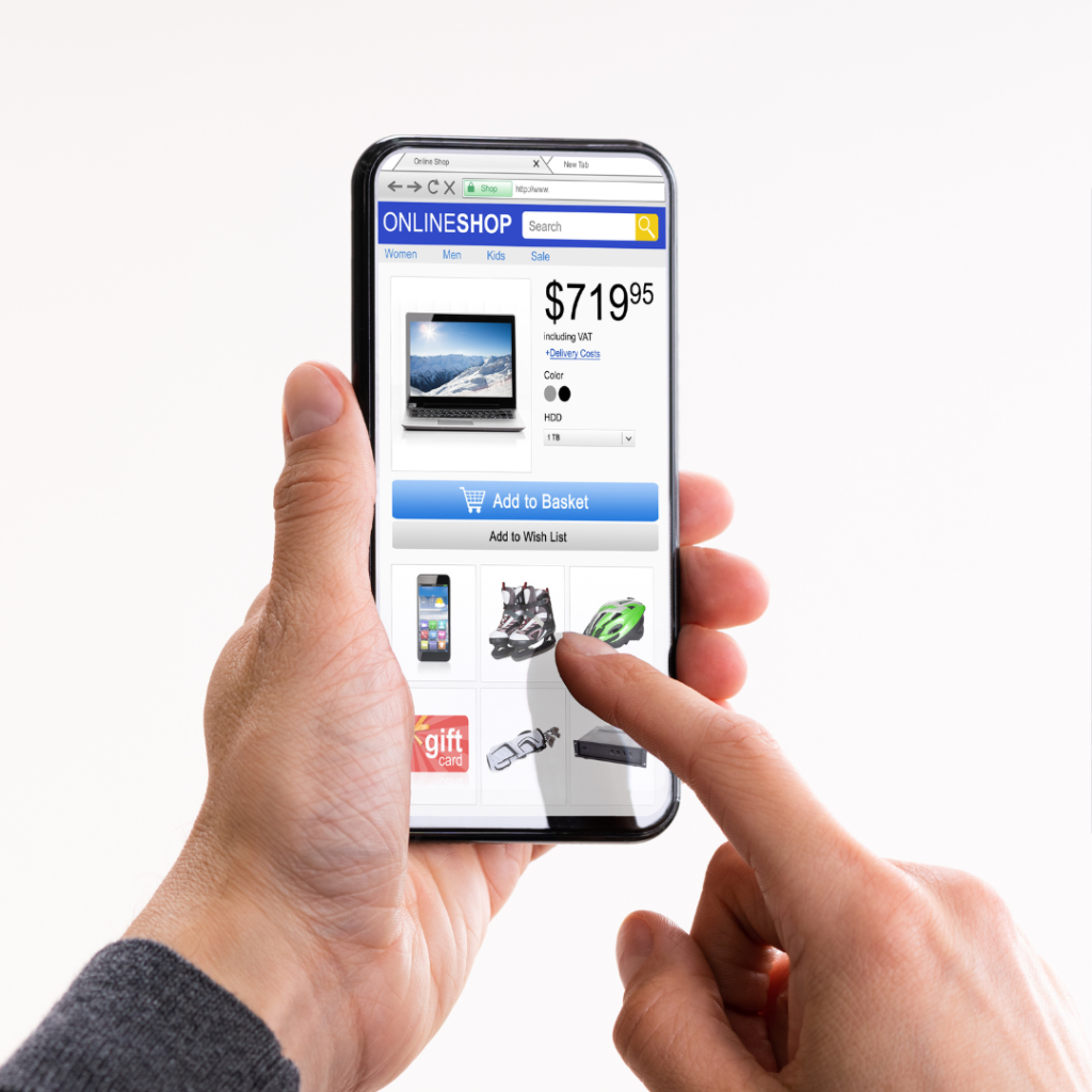
As a result of the move to mobile shopping, firms must modify their tactics to optimize for smartphones and tablets. This is more than simply having a flexible website; it entails building a smooth and engaging purchasing experience that is geared to the specific demands of mobile consumers.

Here are a few basic recommendations for optimizing your website for mobile shopping:
1. Prioritize speed. Because mobile visitors are notoriously impatient, it’s critical that your website loads quickly. Reduce latency and improve load times by using compressed pictures, minifying code, and utilizing a content delivery network (CDN).
2. Use a mobile-friendly design. Your website should be simple to explore and utilize on a tiny screen. To make your material simple to read and engage with, use large fonts, clear call-to-actions, and enough of white space.
3. Optimize your checkout procedure. The checkout procedure is an important part of the mobile purchasing experience. Make it streamlined and simple to follow, with few stages and clear directions.
4. Provide mobile payment choices. Provide a choice of mobile-friendly payment methods, such as digital wallets and one-click payments, to make it easier for mobile consumers to pay for their purchases.
5. Make use of mobile advertising that is targeted. With tailored mobile advertising, you can reach your target demographic. Use mobile ad networks to run adverts on relevant websites and applications for your products or services.
6. Test your website on various devices. Before launching your mobile-optimized website, test it on a range of devices to confirm that it functions properly.
You can develop a mobile-first shopping experience that will help you grow sales and enhance customer happiness by following these guidelines.
In addition to the suggestions above, consider the following when optimizing your website for mobile shopping:
- Use high-quality product photos that are mobile-friendly.
- Make your product descriptions as clear and succinct as possible.
- Use social media to spread the word about your mobile shopping experience.
- Encourage consumer feedback and reviews.
The Evolution of Mobile Shopping
For some years, mobile shopping has been on the increase, and it is currently the dominating type of e-commerce. Mobile commerce sales are estimated to reach $5.2 trillion in 2023, accounting for more than 70% of all e-commerce revenues. Several factors are driving this trend, including the rising cost of smartphones, the popularity of high-speed mobile internet, and the ease of buying from anywhere at any time.
What Is the Importance of Mobile-First Shopping?
Businesses must embrace mobile-first buying for a variety of reasons. For starters, it is where the bulk of consumers purchase. If your website is not mobile-friendly, you are missing out on a big number of prospective customers. Second, mobile users are more inclined than desktop users to make spontaneous purchases. This is due to the fact that individuals are more inclined to use their phones when they are bored or have spare time. Finally, mobile users are more inclined than non-mobile users to interact with your brand via social media and other mobile channels. This might assist you in developing relationships with your target audience and raising brand recognition.
How to Optimize Your Website for Mobile Shopping
There are various things you can do to improve your website for mobile shopping. Here are some pointers:
- Use a responsive design. This implies that your website will automatically resize to fit the screen of any device.
- Make use of huge fonts and obvious call-to-actions. This will make it easier for mobile consumers to read your information and engage with your website.
- Make sure your website loads quickly. Because mobile visitors are notoriously impatient, it’s critical that your website loads quickly. Reduce latency and improve load times by using compressed pictures, minifying code, and utilizing a content delivery network (CDN).
- Improve your checkout procedure. The checkout procedure is an important part of the mobile purchasing experience. Make it streamlined and simple to follow, with few stages and clear directions.
- Provide mobile payment choices. Provide a choice of mobile-friendly payment methods, such as digital wallets and one-click payments, to make it easier for mobile consumers to pay for their purchases.

Tips for Improving Your Mobile Shopping Experience
- Use high-quality product photos that are mobile-friendly. This allows mobile consumers to see your items in more detail.
- Make your product descriptions as clear and succinct as possible. Because mobile visitors are less inclined to read big blocks of text, make your product descriptions easier to skim and comprehend.
- Use social media to promote your mobile purchasing experience. Share connections to your mobile website and app on your social media networks.
- Encourage customer feedback and testimonials. Positive customer evaluations may assist potential consumers create confidence and inspire them to make a purchase.
Conclusion
By following these guidelines, you can develop a mobile-first shopping experience that will help you grow sales and enhance customer happiness. Mobile shopping is here to stay, so make sure your company is ready to capitalize on this increasing trend.